Onirix Node Inspector
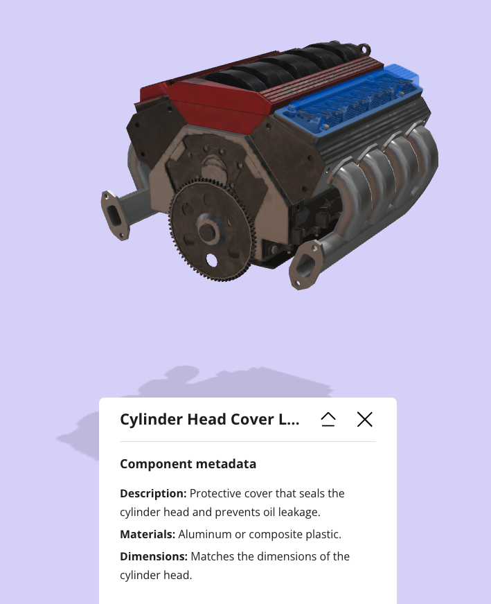
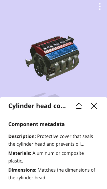
Onirix Node Inspector allows you to highlight specific parts of your 3D models and link useful and readable information to the users of your experiences. From the Onirix Studio editor, through our Datastore, you can create data structures with all the information you want to link to a specific node of the 3D model of your experience.
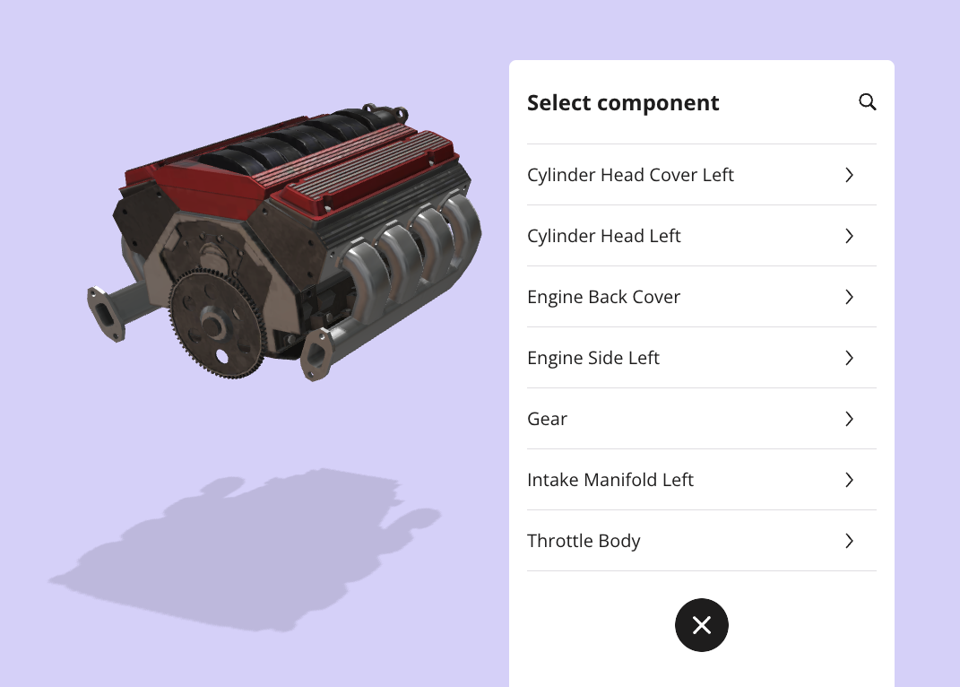
This module also includes a search option that allow the user to look for specific parts within a 3D model (inverse way), and highlight that piece automatically:
Prepare your experience
About assets
To work with node highlighting it is necessary that the internal structure of the assets is well formed. Take a look at the EmbedSDK documentation to learn how to retrieve information from asset nodes.
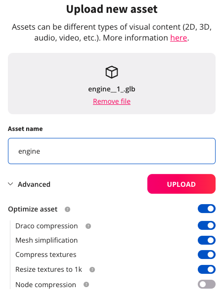
It is important that when you upload your assets to Studio you deactivate the option “compress nodes”. This option is enabled by default to improve the performance of the experiences, but it alters the internal structure of the assets.
You will find more information in the asset and object documentation.
You can also use online tools such as https://sandbox.babylonjs.com/ or https://threejs.org/editor/ to inspect your assets and view the nodes that make them up.
Add information
To add information to the nodes of your assets you must use our Datastore.
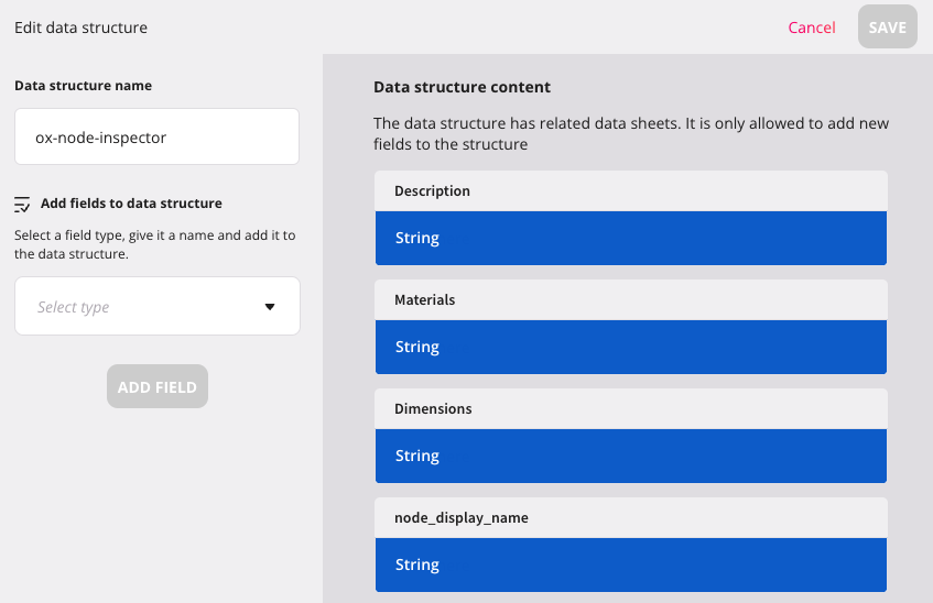
The first step is to create a data structure with the fields you need for your experience. You can name it whatever you want. Onirix Node Inspector by default looks for assets whose structure is ox-node-inspector. If the structure has another name, you must indicate it in the module constructor.
The data structure can have as many fields as you need. You must take into account that, for the moment, Onirix Node Inspector only works with “InputText”, “TextArea” and “Url” type fields. The order of the fields in the data structure will determine the order in which the information will be displayed in the experience.
When you define the name of the fields in your structure you must keep in mind that it will be the name that will be shown in the experience next to each piece of data.
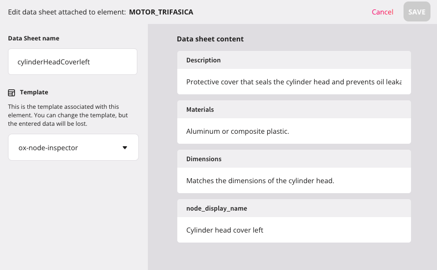
In general you can use any name you want for the fields of the structure but Onirix Node Inspector reserves one: node_display_name. If the structure has such a field, its value will be used to replace the node name in the asset. It is very common that asset node names are not very friendly. By informing this field you will get the experience to use the name you decide instead of the real name of the node. The Onirix Node Inspector search engine will use both names to filter the nodes.
After defining the data structure you want to use, it is time to add the actual information to your model. To do this you must go to the editor, select the element and add a new datasheet. When you create the datasheet you must select the data structure you want to use in the experience and name the datasheet with the same name of the asset node you want to link it to. The name must be exactly the same so that Onirix Node Inspector can relate node and datasheet. Remember that if the node name is not friendly you can use the node_display_name field to display a more descriptive name.
Module import with code editor
To use this module, the minimum necessary is to import it from the code editor, and connect it with our Embed SDK. This is all the code you will need:
import OnirixEmbedSDK from "https://unpkg.com/@onirix/embed-sdk@1.17.1/dist/ox-embed-sdk.esm.js";
import OnirixNodeInspector from "https://unpkg.com/@onirix/node-inspector@1.0.2/dist/ox-node-inspector.esm.js";

const embedSDK = new OnirixEmbedSDK();
await embedSDK.connect();

const onirixNodeInspector = new OnirixNodeInspector(embedSDK);
Configuration options
Onirix Node Inspector offers you several options to adapt its use to your needs. You can configure the operation through a second parameter in the module builder. These are the available options:
enableHighlight(default:true): Whether to enable node highlighting. If you only need to consult the node information, you can deactivate the highlight.highlightParams(default:{type: "box", border: {enable: false}}): Parameters for node highlighting. It allows you to customize the look and feel of your asset nodes. Take a look at the EmbedSDK documentation for more information.dataStructure(default:ox-node-inspector). You can specify the name of the data structure you have created for each experience. This allows you to display different information in each experience but using the same module.showNodeData(default:true): Whether to show node data in the UI panel when a node is selected. Activate this property if you do not want the data panel to open when you touch the node. useful if you only want to use the search engine to find the part.onlyWithDatasheets(default:false): Activate this property if you only want to highlight some parts of your model. Note that a 3D model can consist of many parts. If you only want to highlight some of them activate this flag and the module will only load in the browser the parts that have an associated datasheet.onNodeSelected: callback that is executed each time a node is selected. By implementing this callback we can react to the selection of a particular node. This would allow us, for example, to trigger an audio or video of the particular piece.
In this example we configure the module to only highlight nodes with datasheets that have my-structure as data structure. In addition we will highlight the pieces with a red color.
import OnirixEmbedSDK from "https://cdn.jsdelivr.net/npm/@onirix/embed-sdk@1.17.1/+esm";
import OnirixNodeInspector from "https://cdn.jsdelivr.net/npm/@onirix/node-inspector@1.0.3/+esm";

const embedSDK = new OnirixEmbedSDK();
await embedSDK.connect();

const params = {
    'highlightParams': {
        'color': '#F00'
    },
    'dataStructure': 'my-structure',
    'onlyWithDatasheets': true
}

const onirixNodeInspector = new OnirixNodeInspector(embedSDK, params);
Customize UI
You can adapt the look and feel of the node browser and information panel to your brand image by adding css code to the project through the code editor. These are the selectors you can use to particularize the styles:
| Selector | Description |
|---|---|
| body.ox-node-inspector | This class is added to the body when the module is present. It is useful to make css selectors more specific and unique to the module. |
| .ox-node-inspector__open-list | Element to open the list and the node finder. |
| .ox-node-inspector-list | Element containing the node finder and the list of nodes. |
| .ox-node-inspector-list__panel | List of nodes. |
| .ox-node-inspector-list__close | Element to close the list and the node finder. |
| .ox-node-inspector-list__search-header | Element for the node finder. |
| .ox-node-inspector-list__cancel-btn | Element for closing the node finder. |
| .ox-node-inspector-data | Element with the information of the selected node. |
| .ox-node-inspector-data__expand | Element to expand the node information block. |
| .ox-node-inspector-data__close | Element to close the information block of the node. |
| .ox-node-inspector-data__content | Element with the list of elements for each node data. |
Data attribute
Through the data-node-name attribute and the name of the node we can particularize the appearance of each item in the UI. For example, you could italicize only the “gear” node with a css like this:
ul.ox-node-inspector-list__panel li[data-node-name="gear"] {
    font-style: italic;
}