Online Code Editor
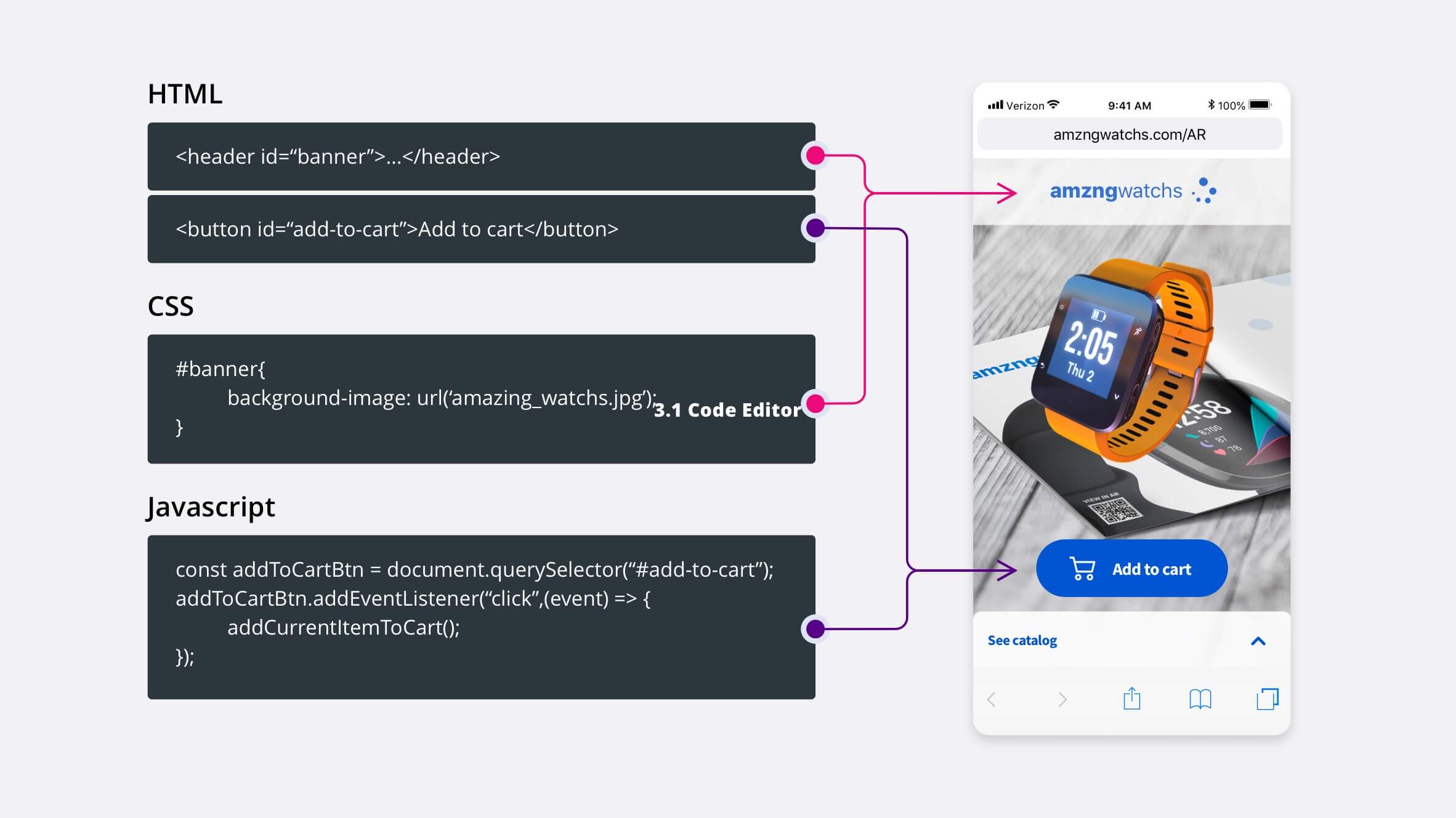
The online code editor allows customizing Web AR player user interface by overriding styles, or adding new elements such as logos, banners or buttons that might even trigger behavioural changes within the AR scene by using the Embed SDK.
If you want to see a complete example, download one of the experiences from our library that already have the code included. For example this quick-start you can see about a boiler.
Accessing the code editor
You can access the code editor from the options menu in the top right area of the scene editor, just above the Properties panel:
This way you can start including HTML, CSS and JS code from scratch, or start from one of our full code examples in our experience library.
Customizing UI
Once you access the code editor, you'll find it uses a 3-column layout. Each column is intended for a different purpose.
- HTML: This will allow you adding new elements to the page.
- CSS: This will allow you creating styles for your new added elements or overriding existing ones.
- JS: This will allow you to listen to events or add interaction to your new created elements, or use the Embed SDK to manipulate the AR scene.
The code editor also allows you to minimize and maximize each column to facilitate the development.
If you want to override any of the following element styles, make sure you use the CSS !important property
In order to look for any other element selectors not listed above, feel free to inspect the source code with your browser's developer tools. Use device-emulator mode or connect a real device to avoid any error when loading the experience.
In the following list you'll find all relevant element selectors:
Main body classes
By default Studio adds some css classes to the <body> of the document. These classes allow us to specify css styles to the rest of the page elements in specific cases. These are the classes that Studio loads by default:
| Selector | Description |
|---|---|
| .ox-fullscreen | Applies when experiences are loaded in full screen mode. WebXR usually works in this mode. |
| .ox-geolocated | It is added when geolocated projects are loaded. The class is always maintained. It doesn't matter if the user is on the map or inside the experience. |
| .ox-app-clip | It is added when the experience is running in Onirix Clip. |
Scene and loading controls
| Selector | Description |
|---|---|
| #overlay | Background container for all overlays (loading, scene selection and error screens) |
| #webar-powered-img | Onirix logo that is shown in loading screen |
| #webar-topbar | Topbar container |
| #webar-bubble-message | Text that is shown in the topbar under some circumstances |
| #webar-fullscreen-button | Button that is shown in the topbar to activate full-screen mode |
| #webar-context-button | Button that is show in the topbar to show the context menu |
| #webar-context-menu | Context menu container |
| #webar-add-button | Button to confirm surface selection (surface scenes only) |
| #webar-close-button | Button to exit from surface selection mode (surface scenes only) |
| #webar-markers-button | Button to open marker list (image scenes only) |
| #webar-markers-bubble | Bubble to encourage users clicking on markers button (image scenes only) |
You can check the E-commerce user experience product carousel for a project that uses these selectors to hide unneeded controls.
Permissions
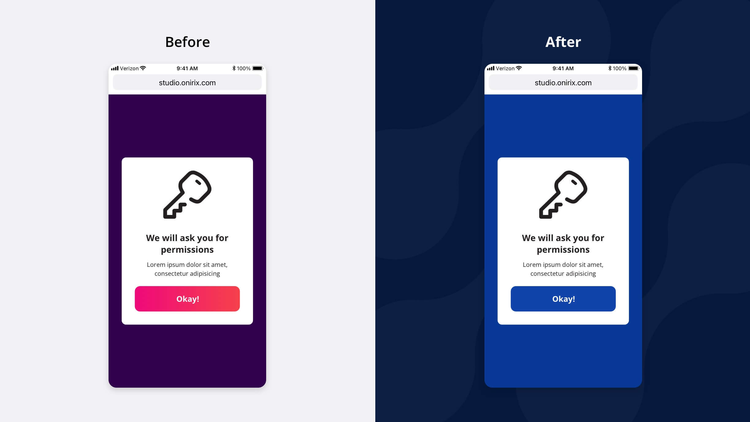
When an iOS user launches Onirix WebAR for the first time, it will show a page warning them about the permissions that they need to accept to use the application.
| Selector | Description |
|---|---|
| #ox-permissions-dialog | Panel that warns the user about permissions |
| #ox-permissions-dialog .btn | Permission dialog accept button |
If the AR scene has been embedded inside an iframe, the CSS must be added from that page instead of the code editor.
Error page
When the user rejects the petition to access the camera of their device or any other error occurs, Onirix shows an error page that can also be personalised from the code editor.
| Selector | Description |
|---|---|
| #error | Background of the page |
| #error-center | Centred container with the error description |
| #error-title | Title with a brief description of the error |
| #error-message | White block containing the steps to fix the error |
Progress bar
| Selector | Description |
|---|---|
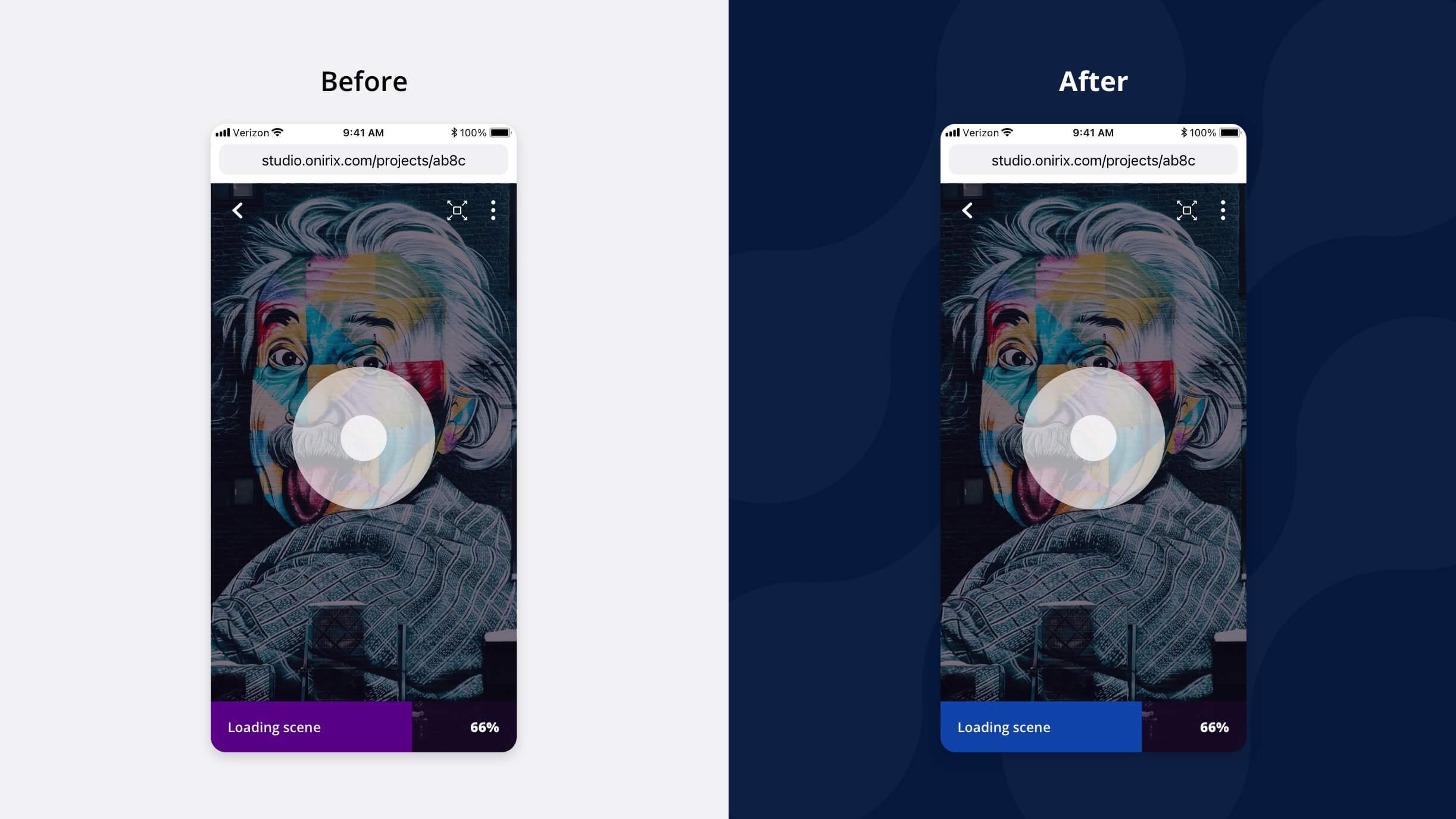
| #ox-progress-bar-container | Progress bar container |
| #ox-progress-bar | Progress bar |
| #ox-progress-loading-text | Progress bar loading text (left side) |
| #ox-progress-percentage-text | Progress bar percentage text (right side) |
Marker preview component
When an image tracking experience is launched, various UI elements are loaded to help the user find the markers that will start the scenes.
| Selector | Description |
|---|---|
| #ox-markers-list | List of all the markers defined in the project |
| #ox-marker-detection-guides | Camera frame guide |
| #ox-marker-detection-controls | View markers purple box |
| #ox-marker-detection-view-images | Button that shows the image list |
| #ox-marker-detection__container | UI container when there is only one marker image. You can use the data-scene-oid attribute to customize each experience differently. |
| #ox-marker-detection-bubble | Title shown when there is only one marker |
| #ox-marker-detection-img | Marker guide when there is only one marker image |
Geolocated experiences
| Selector | Description |
|---|---|
| body.ox-geolocated | When accessing a geolocated project, the ox-geolocated class is added to the body of the document to make it easier to define selectors that only affect this type of project. |
Welcome page
| Selector | Description |
|---|---|
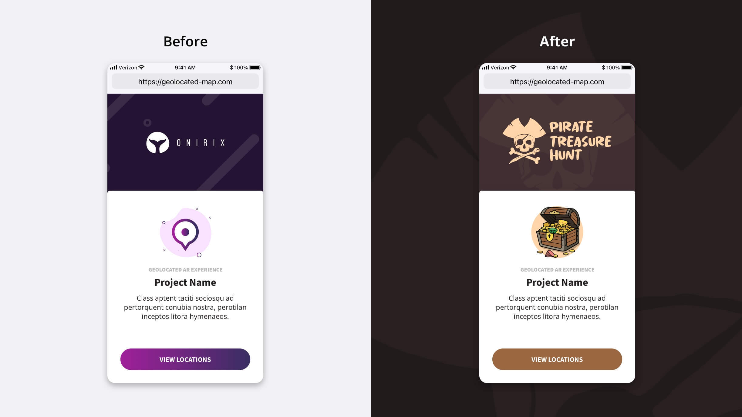
| #webar-geolocated-welcome | Geolocated experience welcome screen container |
| #webar-geolocated-welcome-logo | Geolocated experience welcome screen logo |
| #webar-geolocated-welcome-card | Geolocated experience welcome screen card |
| .ox-g-round-button | Rounded buttons used on the welcome page, map screen and location list |
Map screen
| Selector | Description |
|---|---|
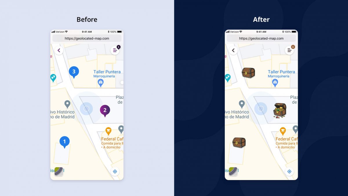
| #webar-geolocated-container | Geolocated experience map container |
| #webar-geolocated-back-button | Geolocated experience back button (from map) |
| #webar-geolocated-menu-button | Geolocated experience menu button (from map) |
| #webar-geolocated-satellite-button | Button for changing the style of the map |
| #webar-geolocated-route-panel | Panel shown when routing to a location |
| .ox-current-position | Button for centering the view at the current location |
| .ox-map-location | Geolocated experience map POI image |
| .ox-map-location-(scene's oid) | Same as .ox-map-location but identified by its scene's oid |
| .ox-location-radius | Activation circle placed around every POI |
Location list and panel
| Selector | Description |
|---|---|
| .ox-map-location-wrapper | It is the main container of the element that represents the experiences on the map. |
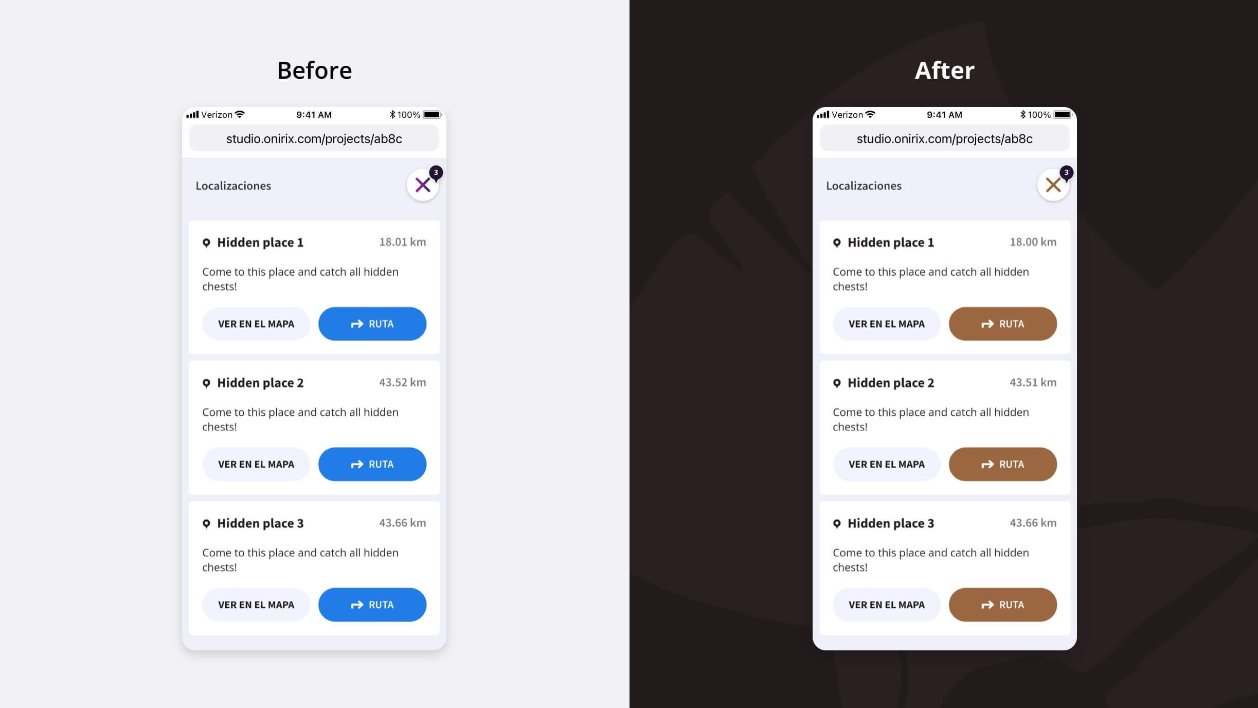
| #webar-geolocated-locations-panel | Geolocated experience location panel (after pressing menu button from map) |
| .ox-location-panel | Geolocated experience location sliding panel (after pressing a POI from map) |
| .ox-location-header | Header of the .ox-location-panel |
| .ox-navigate-button | "View on map" button |
| .ox-route-button | "Route" button |
Data atributes
In geolocalized projects it is often interesting to apply different styles to the elements that represent the different scenes.
Through the attribute data-scene-oid and the value of the oid of the scene we can create different pois for the scenes already visited or for some that we want to highlight. For example if we want to hide a scene we could use these selectors to hide an experience on the map and in the list of experiences
/* Hide map location */
.ox-map-location-wrapper[data-scene-oid="your experience oid"] {
    display: none;
}

/* Hide panel location */
.ox-location-panel[data-scene-oid="your experience oid"] {
    display: none;
}
We have another attribute that allows us to act on the “Go to AR” buttons: data-ox-element="go-to-ar". Let's see some examples:
/* Change the appearance of all "Go to AR" buttons. */
[data-ox-element="go-to-ar"] {
    ...
}

/ * Change the appearance of the "Go to AR" button of a given experience */
[data-ox-element="go-to-ar"][data-scene-oid="your experience oid"] {
    ...
}
For an example of a modified geolocated experience, you can check out the Geolocated Treasure Hunt tutorial.
Location areas
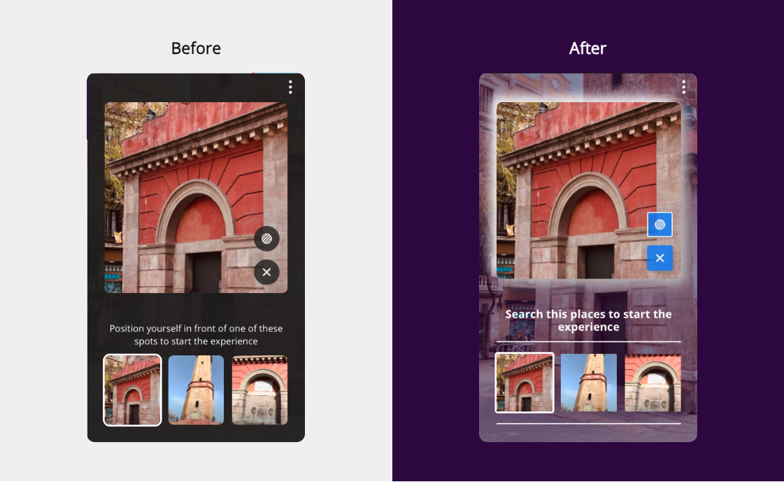
Location areas are the areas where we want to indicate to the end-user that they can start their AR experience.
You can customise this component through the Onirix Studio online code editor to suit your needs or the needs of your brand.
These are the selectors available to change the appearance of the location areas component.
| Selector | Description |
|---|---|
| #ox-location-areas or .ox-location-areas | Root component. You can use the attribute data-location-areas__active-location to know the selected image. |
| .ox-location-areas.ox-location-areas--transparent | Root component when opaque format is off |
| .ox-location-areas__preview | Image preview block |
| .ox-location-areaspreview.ox-location-areaspreview--disabled | Image preview block when no image is selected |
| .ox-location-areas__preview-image | Main image preview block |
| .ox-location-areaspreview-image.ox-location-areaspreview-image--transparent | Main image preview block when semi-transparent format active |
| .ox-location-areas__preview-button | Buttons for toggle opaque format and for closing preview |
| .ox-location-areaspreview-button.ox-location-areaspreview-button--active | Buttons when active. Only applicable to the button to toggle the opaque format |
| .ox-location-areas__preview-opacity-toggle | Button to toggle opaque format |
| .ox-location-areas__preview-close-button | Button for closing the image preview |
| .ox-location-areas__selector | Main block of image thumbnails |
| .ox-location-areas__selector-label | Title of the main block of image thumbnails |
| .ox-location-areas__selector-options | List of thumbnail images |
| .ox-location-areas__selector-option | Each of the miniatures. You can use the data-location-areas__location-id attribute to customize each image separately. |
| .ox-location-areasselector-option.ox-location-areasselector-option--active | Active thumbnail |
| .ox-location-areas__selector-option-image | Image inside thumbnail block |
Surface detection tips
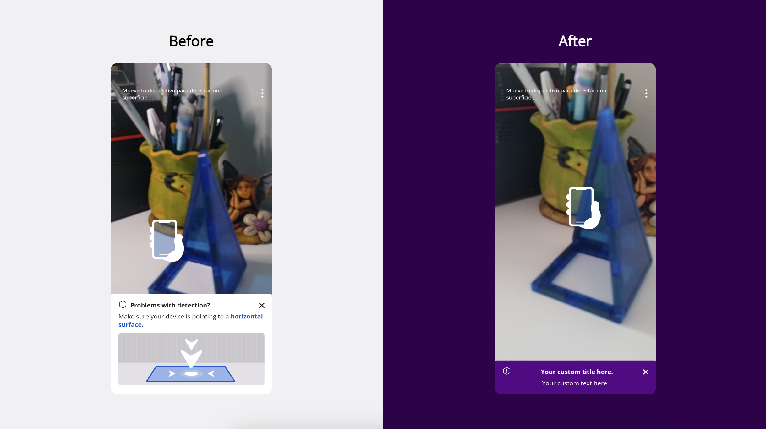
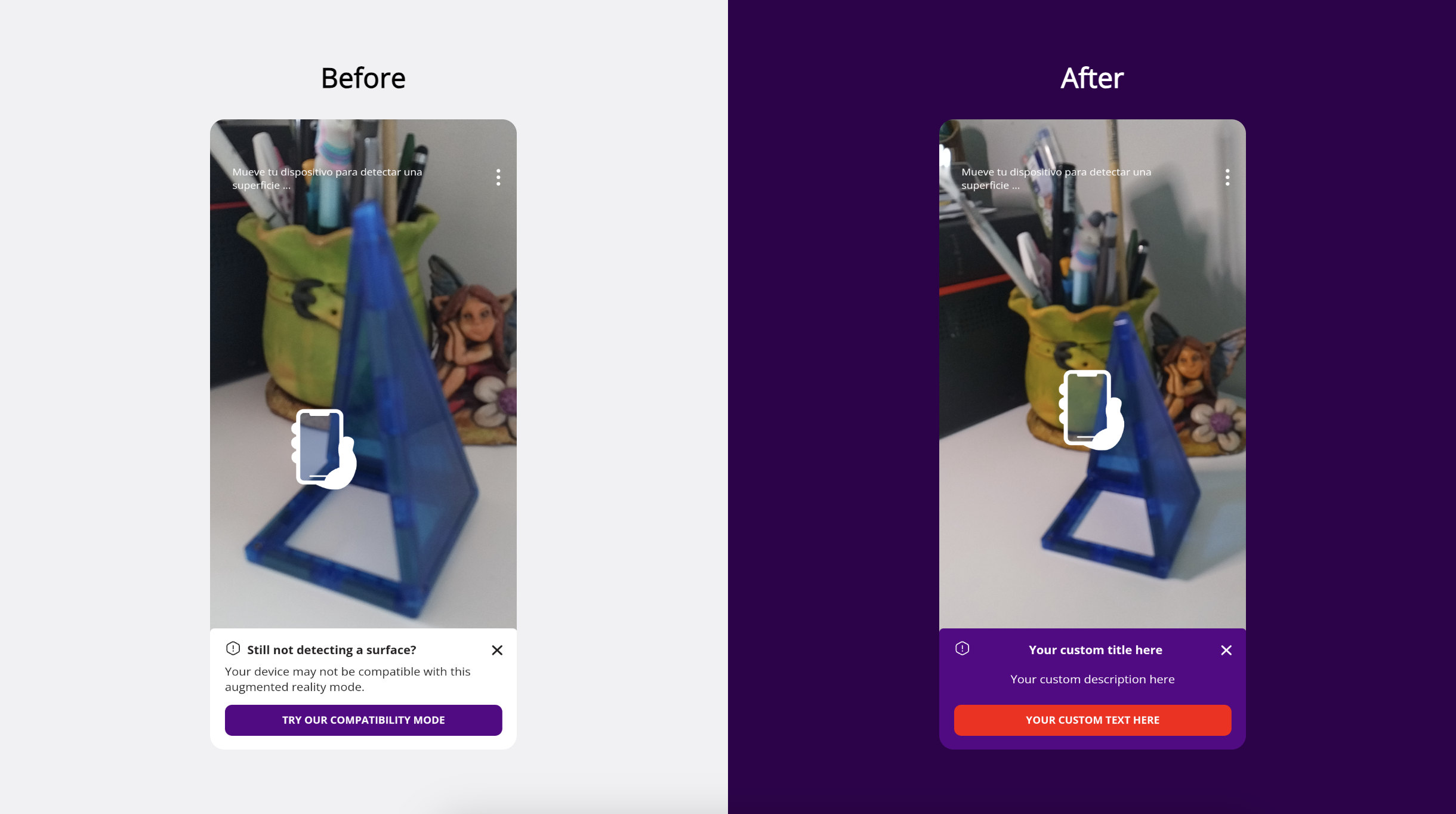
Surface detection tips are two panels that are displayed if Onirix Player detects difficulties in finding a surface on which to place an experience.
Problems with detection
The first one is displayed several seconds after starting the camera and prompts the user to aim at a horizontal surface.
These are the selectors available to change the appearance of the "problems with detection" component.
| Selector | Description |
|---|---|
| .ox-hit-test-hint | Root component. |
| .ox-sheet__header | Component header. Contains the icon, the title and the “X” to close the panel. |
| .ox-sheet__title | Title |
| .ox-sheet__body | Main part of the panel. Contains the text and the image. |
Compatibility mode
If after a few seconds Onirix Player still does not detect a surface a second panel is displayed offering the user access to a compatibility mode.
These are the selectors available to change the appearance of the "compatibility mode" component.
| Selector | Description |
|---|---|
| .ox-hit-test-fallback | Root component. |
| .ox-sheet__header | Component header. Contains the icon, the title and the “X” to close the panel. |
| .ox-sheet__title | Title |
| .ox-sheet__body | Main part of the panel. Contains the text and the button. |
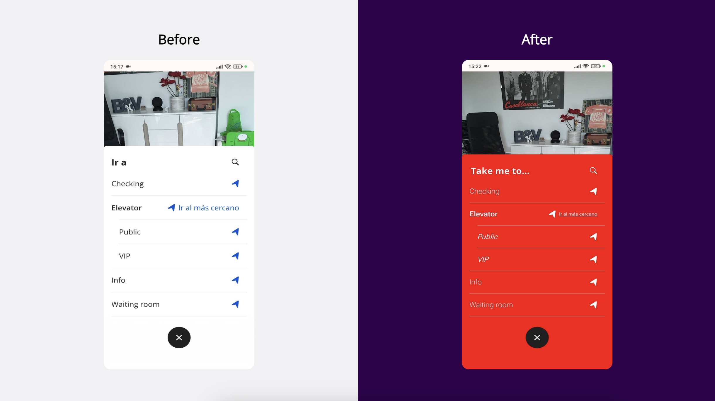
Wayfinding
The Wayfinding UI consists of a menu for destination selection and a panel where the user is shown the distance to the destination during navigation. The main color of this UI (spheres marking the path in AR) must be configured from the project settings. To configure the rest of the UI the following css selectors can be used:
| Selector | Description |
|---|---|
| #ox-wayfinding | Main container of all Wayfinding-related components |
| .ox-wayfinding__open | Element to open the destination panel. |
| .ox-wayfinding--custom-color | Elements with the main color of the guide. |
| .ox-wayfinding-selector | Main panel with available destinations. |
| .ox-wayfinding-selector--searching | Main panel with available destinations in filtered mode. |
| .ox-wayfinding-selector__header | Panel for destination filter components. |
| .ox-wayfinding-selector__list | List of available destinations. |
| .ox-wayfinding-selector__node--category | Block of destinations of a category |
| .ox-category | Element with the category name |
| .ox-category--node | Element with node within a category. |
| .ox-wayfinding-selector__node | Element with node that does not belong to a category. |
| .ox-wayfinding-selectorlistoverlay | Element under the list of nodes in filtered mode. |
| .ox-wayfinding-selector__footer | Element to close the destination panel. |
| .ox-wayfinding-travel | Element displayed during navigation. Displays destination and distance. |
| .ox-wayfinding-travel__distance | Element containing information on the remaining distance to the destination. |
| .ox-wayfinding-travel__close | Element to cancel navigation. |
Data attribute
Through the data-node-oid attribute and the oid value of the destination node we can particularize the appearance of each destination in the UI. For example, we could accompany each destination name with an icon that represents it (exits, information point...).
Code snippets
In this section you'll find some code snippets for common UI modifications. Every example shown here is publicly available in our Online Code Editor Samples repository on GitHub.
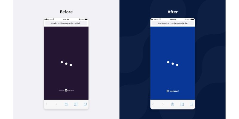
Customize loading overlay with your own logo
CSS
#webar-powered-img {
    display: none;
}
#overlay {
    background-color: #093997 !important;
}

#my-custom-logo {
    position: absolute;
    width: 100px;
    bottom: 150px;
    left: calc(50% - 50px);
}
JavaScript
const overlay = document.querySelector("#overlay");
const logo = document.createElement("img");
logo.setAttribute("id", "my-custom-logo");
logo.setAttribute("src", "https://www.onirix.com/docs/sample-logo.svg");
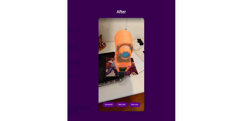
overlay.appendChild(logo);Screenshot and video capture
See the complete module in our documentation
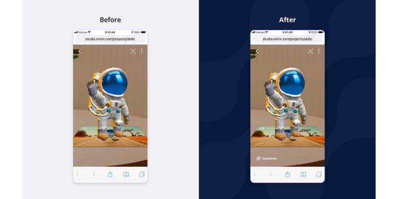
Add a watermark logo
HTML
<img id="watermark-logo" src="https://www.onirix.com/docs/sample-logo.svg">CSS
#watermark-logo {
    position: fixed;
    bottom: 50px;
    left: 50px;
    opacity: 0.5;
    width: 100px;
    height: auto;
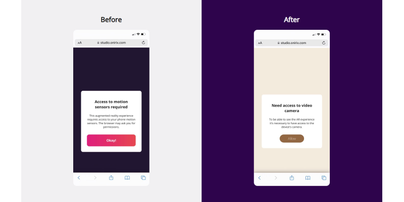
}Change permissions panel
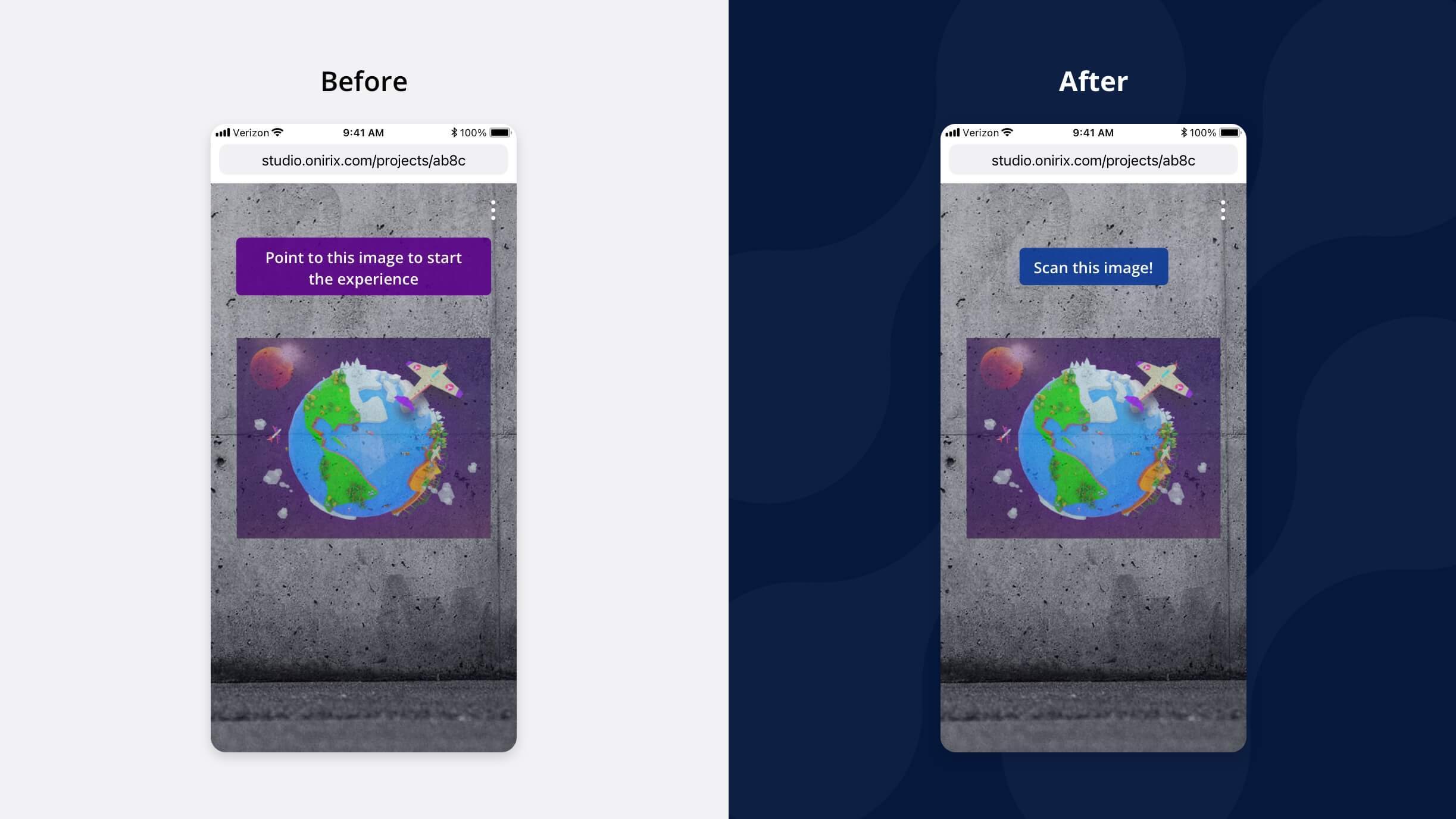
Change color and text of marker preview
CSS
#ox-marker-detection-bubble {
   background-color: #093997;
}

#ox-marker-detection-bubble span {
   display: none;
}

#ox-marker-detection-bubble::after {
   content: 'Scan this image!';
}Do not show image marker list
CSS
#ox-markers-list { display: none }
#ox-marker-detection-guides { display: none; }
#ox-marker-detection-controls { display: none; }
#ox-marker-detection-view-images { display: none; }
#ox-marker-detection__container { display: none; }
#ox-marker-detection-controls + ox-button.web-ar { display: none; }
Share button for social networks
HTML
<button id="share-button">Click to share</button>JavaScript
const shareData = {
  title: 'Onirix',
  text: 'Try our new hunt experience: pair colors',
  url: 'https://player.onirix.com/exp/eB4mWL'
}

document.getElementById("share-button").addEventListener("click", () => {
    navigator.share(shareData)
});
CSS
#share-button {
  position: absolute;
  top: 50px;
  left: 145px;
  background: #df2a54;
  border-radius: 20px;
  padding: 10px;
  color: black;
  width: max-content;
}
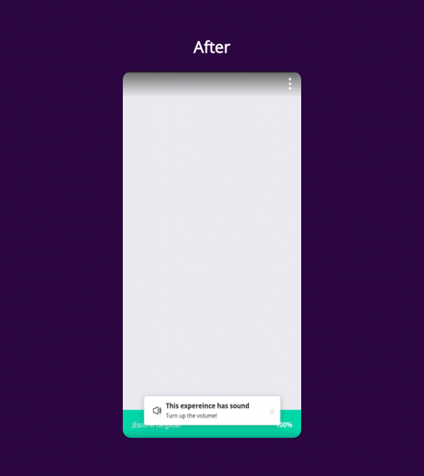
Indicate that a scene has audio
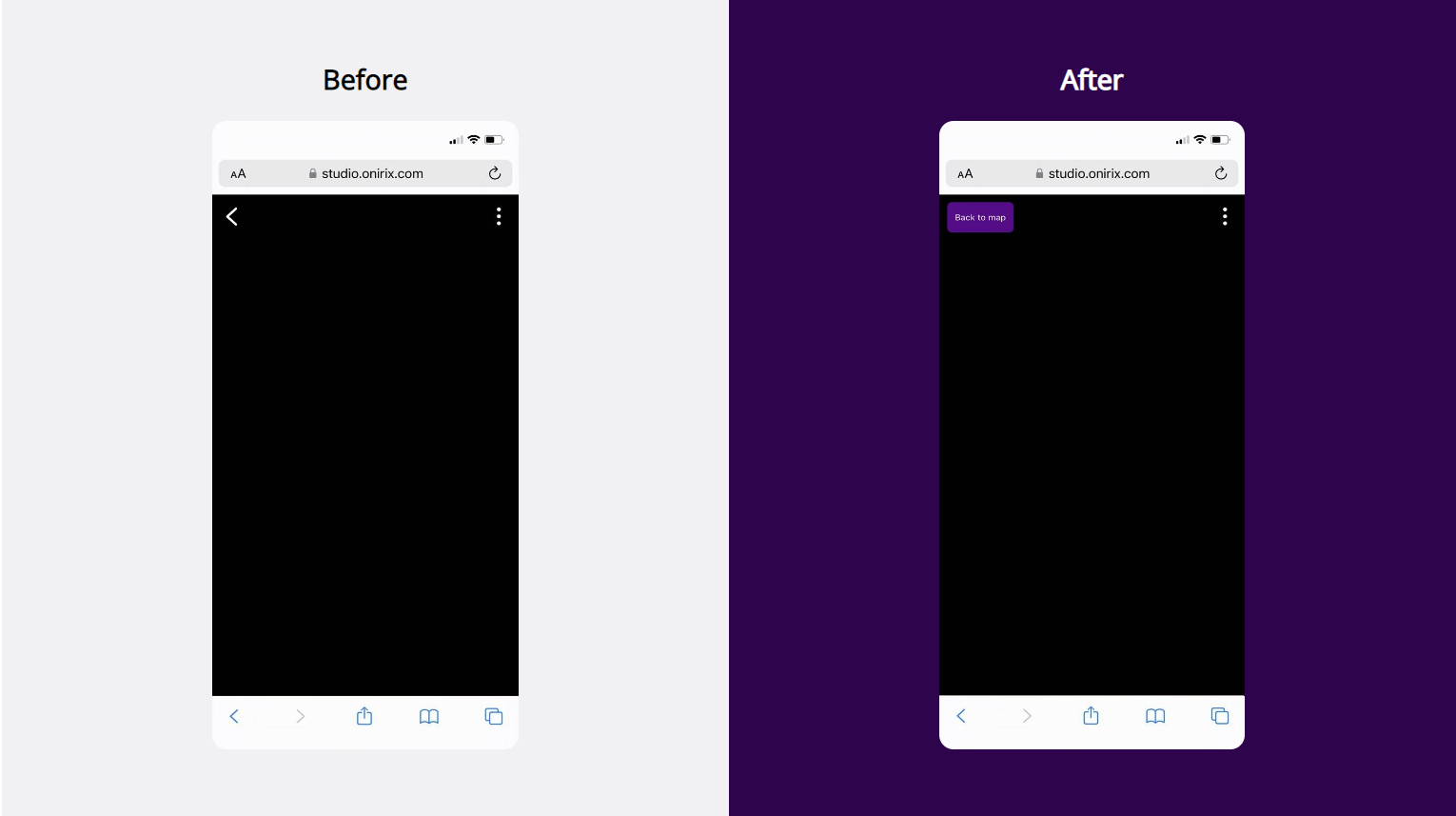
Customize back to map button
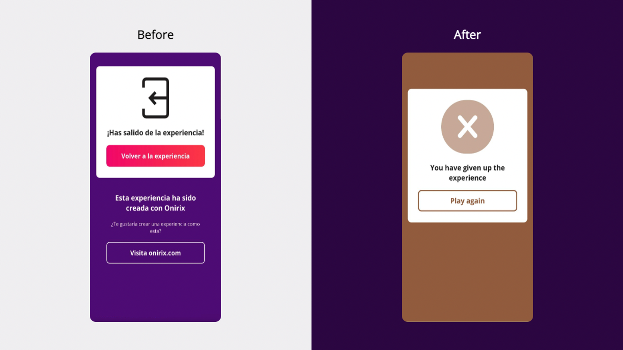
Customize back to experience
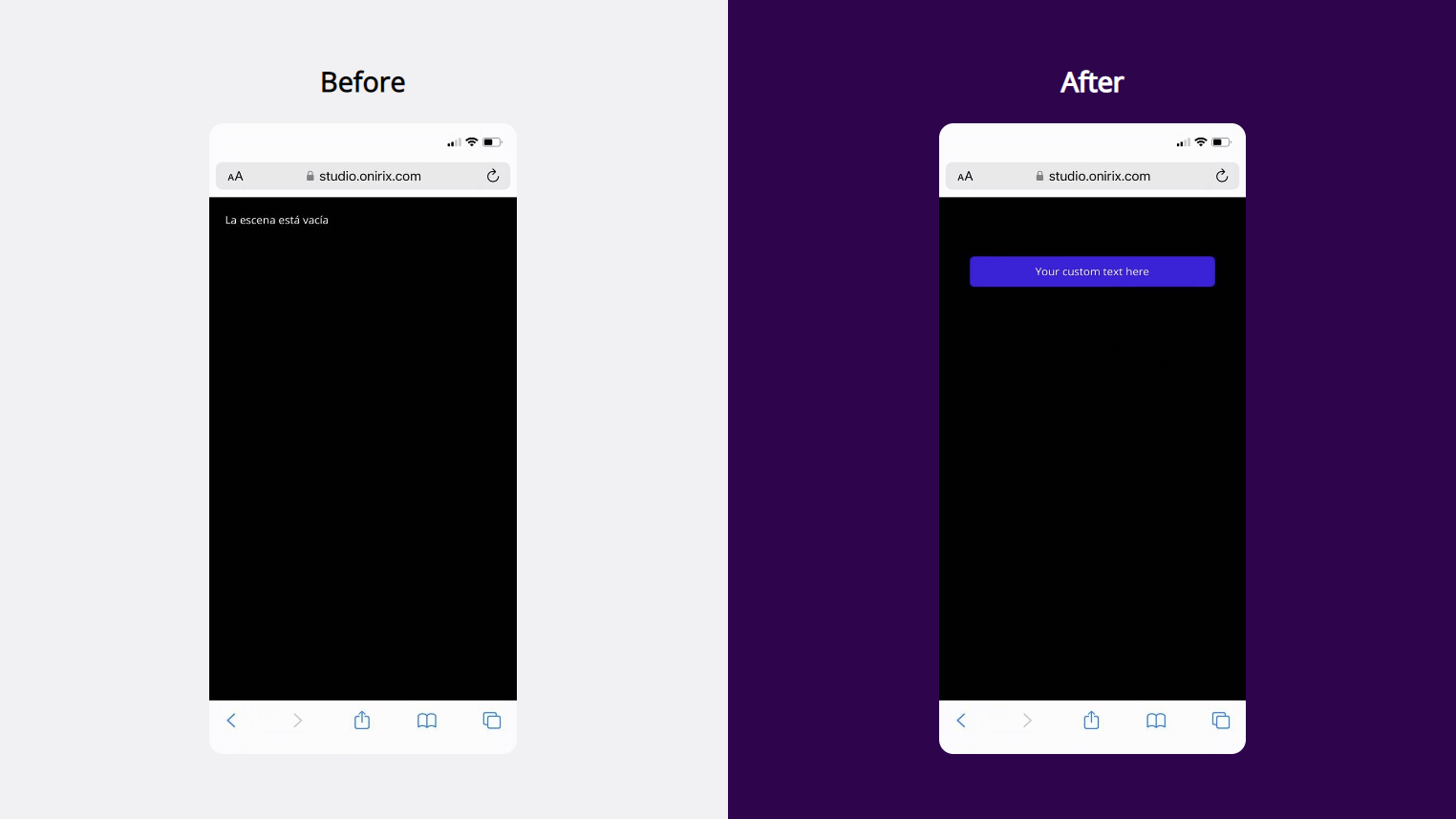
Show HTML on load
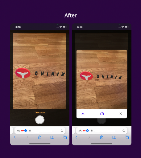
Preview and share snapshot
Customize surface placeholder
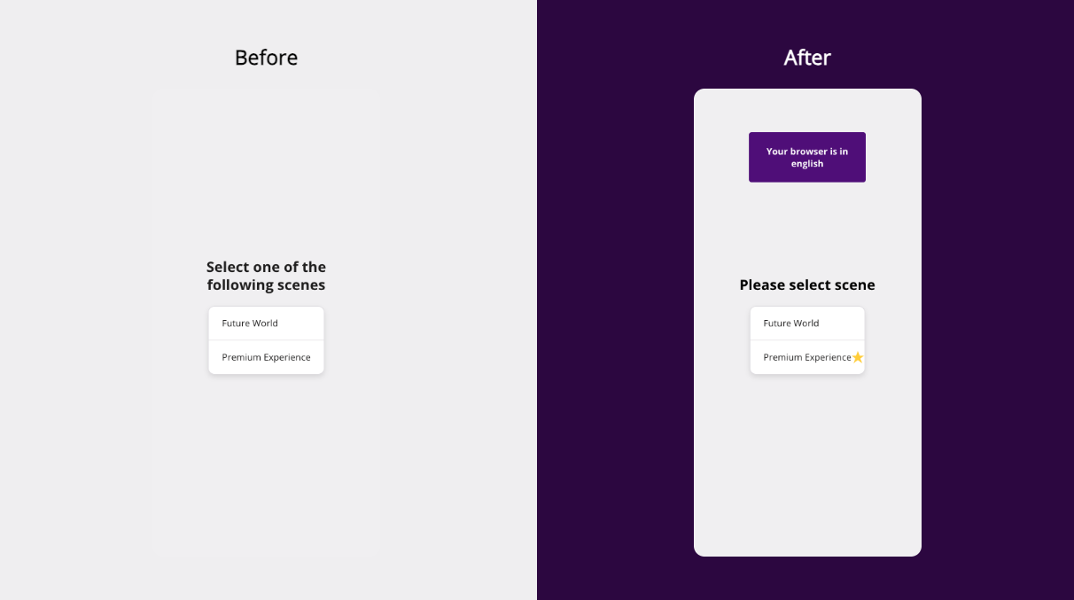
Customize scene selection menu
Customize tracking selection menu
Control safe area
When viewing a full screen experience some devices have certain areas such as the notch, top bar, etc, that cause some UI elements to not display correctly. These examples may help you:
